Ultimate Guide to Threat Severity Visualization
Threat severity visualization simplifies overwhelming cybersecurity data into clear visual formats like heat maps, dashboards, and graphs. This helps security teams prioritize risks, detect patterns, and act quickly. With 65% of people being visual learners and only 1% of big data analyzed, these tools bridge the gap between raw data and actionable insights.
Key points:
- Why it matters: Speeds up decision-making during attacks and helps focus on the 1% of vulnerabilities that pose real threats.
- Who uses it: Security analysts, CISOs, SOC teams, vulnerability management teams, and board members.
- Techniques: Risk heat maps for quick risk assessments, network graphs to map attack paths, and dashboards for real-time threat monitoring.
- Advanced methods: Matrix-based grids like MITRE ATT&CK, graph-based tools for patterns, and hybrid approaches for complex scenarios.
- Best practices: Use real-time data, customize scoring based on business impact, and integrate tools with existing workflows.
These visual tools empower organizations to respond faster and allocate resources effectively, reducing risks and improving overall security posture.
UC2 Risk Ruler for CVSS 4.0: Visualizing Vulnerability Severity and Data Confidence
Core Techniques for Threat Severity Visualization
Threat Severity Levels and Response Framework for Cybersecurity Teams
Security teams use three main visualization methods to interpret vast amounts of threat data. Each one plays a unique role, from offering a big-picture view of risks to diving deep into specific incidents. These techniques lay the groundwork for more advanced methods discussed later.
Risk Heat Maps
Risk heat maps use color-coded grids – red, yellow, orange, and green – to visually represent threat severity. The risk level is calculated by multiplying likelihood by impact. Likelihood factors in elements like an attacker’s skill level and the ease of exploiting a vulnerability, while impact considers both technical outcomes (e.g., data breaches or system downtime) and business consequences (e.g., financial losses, reputational harm, and compliance challenges).
The OWASP Risk Rating Methodology assigns scores from 0 to 9 for these factors. Scores are categorized as follows: 0 to less than 3 is Low, 3 to less than 6 is Medium, and 6 to 9 is High. For instance, a global company might use a heat map to identify that its European offices face high risk (red) due to outdated endpoint protection, while its U.S. offices show low risk (green). This straightforward visualization helps teams act quickly.
A key principle here is that business impact outweighs technical severity. For example, if a vulnerability has a Medium likelihood but a Low business impact, it should be rated as Low overall. This ensures that security resources are allocated to areas that matter most, speeding up decision-making and focusing efforts effectively.
Network and Attack Path Graphs
Network graphs provide a visual map of connections between users, systems, and threat indicators. They highlight lateral movement routes, entry points, and attack pathways.
These tools can display up to 20 entities per threat object (such as a file hash or payload) to keep the analysis clear. When multiple findings share the same threat object, the tools automatically link them, giving analysts a broader view of incidents.
The industry is moving away from simple lists of indicators and toward visualizing entire attack chains. As John Lambert famously said:
"Defenders think in lists. Attackers think in graphs. As long as this is true, attackers will win".
Attack flow visualizations show how one adversary technique leads to another, helping teams identify key "choke points" where defenses can be concentrated. This approach not only speeds up investigations but also improves response coordination.
Threat Intelligence Dashboards
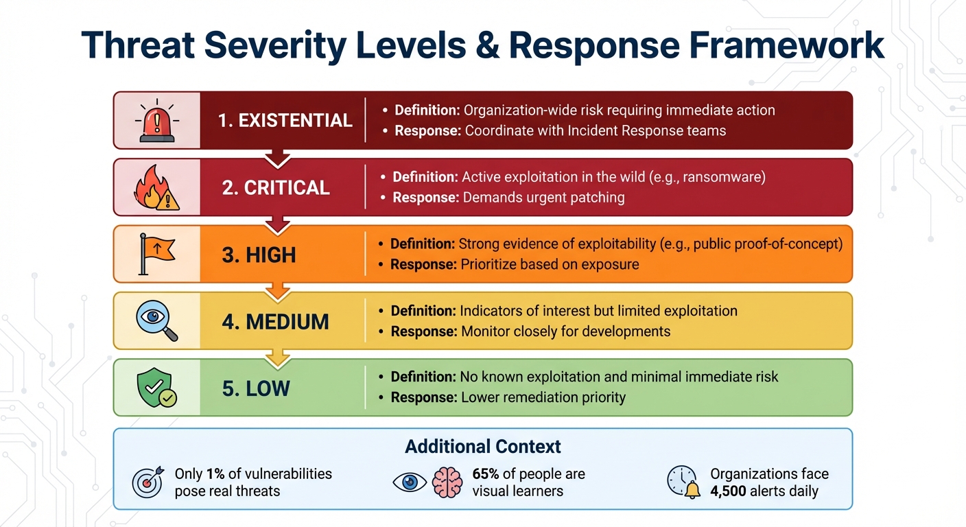
Dashboards take visualization a step further by providing real-time threat monitoring. These platforms aggregate live data, track critical metrics like Time-to-Detect (TTD), and flag high-risk vulnerabilities that are actively being exploited.
Unlike static CVSS scores, dashboards assign dynamic, intelligence-driven threat ratings. Severity levels range from "Low" to "Existential", based on real-world data such as exploit weaponization, ransomware links, and media coverage. For example, Nucleus Insights monitors media mentions of vulnerabilities over 30-, 90-, and 180-day periods, as increased media attention often signals heightened attacker interest.
| Severity Level | Definition & Response Approach |
|---|---|
| Existential | Organization-wide risk requiring immediate action; coordinate with Incident Response teams |
| Critical | Active exploitation in the wild (e.g., ransomware); demands urgent patching |
| High | Strong evidence of exploitability (e.g., public proof-of-concept); prioritize based on exposure |
| Medium | Indicators of interest but limited exploitation; monitor closely for developments |
| Low | No known exploitation and minimal immediate risk; lower remediation priority |
For "Existential" vulnerabilities, bypass standard patch cycles and escalate directly to Incident Response teams. This tiered system ensures that responses are proportionate to the actual threat, enabling organizations to act swiftly and efficiently.
Advanced Visualization Methods
When it comes to tackling complex threat scenarios, advanced visualization methods prove indispensable. They go beyond basic techniques, providing tools to dissect multi-dimensional threat landscapes. These visualizations enhance traditional tools like risk heat maps and network graphs, offering a deeper understanding of threat behavior. They help security teams examine intricate attack patterns, pinpoint defensive gaps, and see how cyber threats interact with physical systems.
Matrix-Based Visualizations
Matrix-based visualizations rely on grid layouts to map potential threats across two axes: likelihood of occurrence and severity of impact. In cybersecurity, the MITRE ATT&CK Matrix has become a cornerstone, organizing adversary behaviors into tactics (overarching objectives) and techniques (specific methods). This framework provides a shared language for defenders. The Enterprise version currently outlines 14 tactics and 211 techniques.
These grids are invaluable for identifying gaps in detection. For instance, a 5×5 risk matrix offers 25 possible scenarios, compared to the limited 9 scenarios in a basic 3×3 matrix. This added granularity allows for a more precise assessment of risks.
The data shows a 27% year-over-year rise in interactive intrusions from July 2024 to June 2025, with 81% of these intrusions being malware-free. This underscores the need for matrices that focus on adversary behaviors rather than static malware signatures. As Chris Prall, Senior Product Marketing Manager at CrowdStrike, puts it:
"The goal is to give security teams a common language for the tactics and techniques that form the building blocks of intrusion activity".
To stay ahead, update your risk matrix quarterly. Ensure it’s backed by strong telemetry, such as process execution logs, PowerShell logging, and authentication event data.
Graph-Based Visualizations
Graph-based visualizations use node-link diagrams to map interconnected threat data. Tools like Graph Convolutional Networks (GCN) extract valuable structural insights from unstructured threat intelligence. For example, the CtiErRe model achieved impressive performance, with an F1 score of 93.11% for entity recognition and 92.45% for relationship recognition. Additionally, the CAPEC classification method identifies over 500 distinct attack types, offering a clearer understanding of how vulnerabilities are exploited.
Automated risk scoring and visualization can reduce security alert noise by a staggering 99.9%, enabling teams to focus on the most critical assets. Real-time intelligence paired with these visualizations helps security teams respond to high-risk threats up to 60% faster.
Incorporating domain knowledge graphs can further enhance threat intelligence by using specialized vocabulary. Linking log data to specific assets, like users or machines, adds context, factoring in asset priority and vulnerability status.
Hybrid Visualization Approaches
For the most complex scenarios, hybrid visualization approaches combine multiple techniques to deliver a comprehensive view of both cyber actions and their real-world impacts. These approaches integrate node-link graphs, matrices, and visual metaphors like timelines, creating layered insights into threat severity. Hybrid Attack Graphs (HAGs), for instance, represent Cyber-Physical System (CPS) states and dynamics as nodes, with adversary tactics and physical actions forming the edges.
The HAGEN project developed a framework to generate these hybrid graphs for CPS resilience. Using Graph Convolutional Deep-Q Learning (GCDQ), researchers created 4,096 sparse HAGs based on 620 documented software instances from MITRE. This enabled predictions of adversary techniques with a normalized detection reward of 0.81, making it possible to simulate "what-if" scenarios for critical infrastructure.
Hybrid methods are particularly effective for gap analysis. They allow security teams to overlay existing controls onto threat matrices, exposing undetected techniques. Tools like the MITRE Attack Navigator transform static grids into dynamic risk visualization tools by integrating scoring, heatmaps, and annotations. Combining matrix, graph, and timeline views supports swift, accurate severity assessments.
To highlight high-priority techniques that lack mitigation, use numerical scores and color gradients within matrix cells. For long-term threats like APTs, timeline visualizations can link scattered indicators of compromise (like IPs, hashes, and domains) to specific stages of an attack.
sbb-itb-9b7603c
Tools and Platforms for Threat Severity Visualization
Choosing the right platform can mean the difference between drowning in alerts and catching critical threats early. The key lies in integrating and prioritizing threat data based on your organization’s specific risk profile. Platforms that use intelligence-driven enrichment help security teams zero in on the roughly 1% of vulnerabilities that truly matter. Let’s dive into how these platforms, particularly those powered by AI, turn raw data into actionable visual threat intelligence.
AI-Powered Platforms like The Security Bulldog
The Security Bulldog is a standout example of how AI can simplify threat management. Using a natural language processing (NLP) engine, it transforms open-source data into actionable insights. The platform automatically maps threats to the MITRE ATT&CK framework and visualizes CVE severity scores, creating a clear picture of your attack surface. With features like semantic analysis, custom feeds, and seamless integration with tools like SOAR and SIEM, it helps make sense of scattered intelligence.
Why does this matter? Consider this: organizations face an average of 4,500 alerts daily, and 97% of security analysts worry about missing something critical. AI-powered tools like The Security Bulldog tackle this by using NLP to identify and tag MITRE ATT&CK techniques directly from blogs and threat reports. This automation drastically reduces manual effort. The results? A 20X improvement in Mean Time to Detect (MTTD) and an 8X improvement in Mean Time to Response (MTTR) compared to traditional methods. As Stellar Cyber puts it:
"Traditional Security Operations Centers can no longer keep pace with the velocity and sophistication of modern threats".
Features to Look for in Visualization Tools
When evaluating platforms, focus on tools that go beyond basic CVSS ratings. The best systems use composite threat scoring, factoring in elements like exploitation evidence, ease of attack, potential consequences, zero-day status, and malware association. Look for features such as:
- Ransomware exploitation flags
- Time-sensitive media monitoring
- Indicators of weaponized exploits
Real-time heatmaps are also invaluable. These dynamic tools change color as attacker tactics evolve, offering immediate awareness of activities like lateral movement or privilege escalation. Graph-based exploration capabilities further enhance analysis by mapping relationships between indicators, malware families, intrusion sets, and affected victims. This makes it easier to pivot between data points and uncover connections.
Customizable dashboards are another must-have. They allow you to design widget-based interfaces to track key metrics like MTTD and MTTR, ensuring your team stays on top of performance.
Finally, integration is critical. A good visualization tool should seamlessly connect with SIEM, SOAR, and EDR platforms to automate tasks like isolating compromised systems or blocking malicious IPs. Advanced platforms can normalize new data sources in minutes, condensing hundreds of alerts into just the most urgent ones – a process that used to take days. For teams dealing with "Existential" vulnerabilities – those posing immediate, organization-wide risks with no effective mitigations – automation is key. Your platform should be capable of triggering workflows instantly when such threats are identified.
Best Practices for Threat Severity Visualization
To make the most of threat severity visualizations, it’s not just about picking the right tool – it’s about using it effectively. The difference between an overwhelmed security team and one that stays ahead of threats often boils down to three key practices: keeping data up-to-date, customizing scores to match your business priorities, and ensuring your visualization tools work seamlessly with your existing security operations.
Use Real-Time Data Updates
Threat data can become outdated in the blink of an eye. A vulnerability that seemed theoretical yesterday might be actively exploited today. That’s why your visualization tools must reflect changes in real-time. With real-time data feeds, security teams can connect external threat intelligence to their specific attack surface in under a minute. This speed is critical considering that 38% of organizations update their cyber threat intelligence requirements on an ad hoc basis.
Take the RedEcho attack on India’s power sector as an example. Between April 2019 and February 2021, domain registrations and IP detections linked to the attack weren’t consolidated into a real-time threat intelligence database. As a result, it took nearly two years – from the first attacker domain registration in April 2019 to the release of a domain blacklist and security advice by Recorded Future in February 2021. Real-time visualization could have drastically shortened this timeline.
Modern platforms can process updates in under a minute. This capability is essential for dynamic severity scoring, which adjusts based on exploit maturity and active threats. As noted in FIRST.Org’s CVSS v4.0 guidance:
"The Threat Metric Group adjusts the ‘reasonable worst case’ Base score by using threat intelligence to reduce the CVSS-BTE score, addressing concerns that many CVSS (Base) scores are too high".
To stay proactive, automate the ingestion of logs and threat intelligence feeds through platforms like SIEM or SOAR. Relying on manual updates creates delays and leaves gaps in your defenses. Real-time updates form the foundation for accurate, business-aware risk assessments.
Customize Scoring Based on Business Impact
Relying solely on CVSS Base scores for risk assessment doesn’t paint the full picture. As FIRST.Org explains:
"The CVSS Base Score represents only the intrinsic characteristics of a vulnerability and is independent of any factor associated with threat or the computing environment… [it] should not be used alone to assess risk".
To get a clearer view, enrich these scores with Environmental and Threat Metrics that reflect your organization’s specific risks. For example, a "High" severity vulnerability on an internal test server carries far less risk than the same vulnerability on a publicly accessible payment system. Your visualizations should make these distinctions obvious.
Consider defining severity levels that trigger specific responses. Nucleus Security offers a practical framework:
| Threat Rating | Business Impact | Action Required |
|---|---|---|
| Existential | Immediate, organization-wide risk; active exploitation; no effective mitigations | Treat as an incident; coordinate with incident response (IR) teams; prioritize across all assets |
| Critical | Confirmed exploitation in the wild; severe impact; widely weaponized threats | Accelerate patching or apply compensating controls; enforce organizational SLAs |
| High | Strong evidence of exploitability; reliable public proof of concept (PoC) | Prioritize based on business context and asset exposure |
By linking vulnerability scanners with asset management databases, you can automatically apply Confidentiality, Integrity, and Availability (CIA) requirements to scores. Tracking media mentions over time (e.g., 30, 90, and 180 days) can also help identify emerging threats, as spikes in coverage often signal rising risks. This approach ensures your team focuses on the small percentage of vulnerabilities – about 1% – that truly require immediate action.
Integrate Visualization Tools with Existing Workflows
Visualization tools are most effective when they’re part of a larger, well-tuned security ecosystem. They aren’t standalone solutions – they need to integrate seamlessly with your broader security operations. For instance, SIEM and SOAR platforms require ongoing adjustments to stay effective as threats evolve. A well-configured SIEM consolidates log data into clear dashboards, while the visualization layer translates this data into actionable insights.
To streamline responses, develop predefined playbooks within your SOAR platform. These playbooks can automate actions like isolating a network source or blocking malicious IPs when high-severity events appear in your visualizations. Use threat enrichment fields (e.g., “Nucleus exploited is ‘Yes’”) to trigger automated severity updates or remediation workflows.
Regular testing is also essential. Engage external professional services, such as penetration testers, to verify that your visualization and alerting systems can detect real-world threats effectively. For example, Bitsight’s data lake contains 540 billion cyber events, but that scale only matters if your visualization tools can distill this information into actionable insights that fit seamlessly into your workflows.
Conclusion
Summary of Visualization Techniques and Tools
Threat severity visualization transforms massive amounts of security data into clear, actionable insights. Throughout this guide, we’ve explored how risk heat maps use color-coded grids to communicate impact and likelihood to executives, making complex data easier to digest. Similarly, network and attack path visualizations reveal lateral movement paths that might be missed in traditional text-based logs. Knowledge graphs go even further, connecting the dots between threats, vulnerabilities, and network components, helping security teams see the bigger picture and uncover patterns in what might otherwise appear as isolated events.
Visualization tools are also crucial for focusing on what matters most. They help teams zero in on the 1% of vulnerabilities actively being exploited, cutting through the noise. As Jamie Rucker, Sr. Manager of Cybersecurity at Centric Consulting, puts it:
"Your team is overloaded with data yet lacking clear insights. Risk visualization tools like heat maps, dashboards, and visual models convert threat data into clear actions".
How The Security Bulldog Supports Visualization Needs
Specialized platforms take these visualization methods to the next level, and The Security Bulldog is a prime example. Its AI-powered NLP engine processes millions of security documents daily from sources like MITRE ATT&CK, CVEs, podcasts, and news outlets. By automating this research, the platform reduces manual effort by 80%, freeing up teams to focus on addressing actual threats rather than drowning in raw data.
Integration is another standout feature. The Security Bulldog seamlessly connects with existing security stacks, including SOAR tools, to automatically incorporate refined threat intelligence into workflows. Role-based customization ensures that everyone – from SOC analysts to managers – sees the visualizations most relevant to their responsibilities. With pricing starting at $850/month for up to 10 users, it offers enterprise-grade capabilities without the steep learning curve of traditional SIEM systems.
Moving Forward with Threat Visualization
Armed with a solid understanding of visualization tools and platforms, organizations can take their threat response strategies to the next level. Moving from reactive firefighting to proactive defense is critical – especially with global cybercrime costs projected to hit $10.5 trillion annually by 2025. Start small by creating a focused, high-priority dashboard tailored to your environment. Keep it simple and actionable by concentrating on high-risk assets and threats that directly impact your business operations.
These visualization techniques enable teams to quickly identify and respond to critical threats, strengthening their overall security posture. Track metrics like time-to-detect (TTD) and time-to-contain (TTC) to gauge how visualization impacts response times. Ultimately, it’s not about flashy graphics – it’s about delivering the clarity needed to make faster, smarter decisions in the face of emerging threats. Organizations that master this balance will be better equipped to stay ahead of the ever-evolving cyber threat landscape.
FAQs
How can visualizing threat severity enhance cybersecurity response times?
Threat severity visualizations turn complicated data into straightforward visuals like heat maps, graphs, or knowledge graphs. These tools allow analysts to quickly pinpoint high-risk threats, ensuring they can focus on the most pressing issues right away.
By simplifying threat detection and prioritization, these visualizations cut down response times, making it easier to act quickly and address incidents efficiently.
What are the best practices for integrating threat visualization tools into security workflows?
To make visualization tools a meaningful part of your security workflows, think of them as a real-time extension of your threat intelligence and incident response efforts – not just another reporting tool. Start by aligning your visualizations with a recognized framework like MITRE ATT&CK. This framework helps organize tactics, techniques, and incidents in a way that’s clear and consistent. Ensure your dashboards pull real-time data from tools you already use, like case management systems or threat indicator feeds, so your insights stay timely and actionable.
Design dashboards with specific roles in mind. Whether for analysts, managers, or SOC leads, focus on actionable metrics such as severity levels and response stages. Use consistent color schemes and separate panels for detection, response, and remediation to help each team member navigate their tasks more efficiently.
When choosing a platform, look for one that integrates smoothly with your current tools, like SIEM or SOAR systems, to create a closed-loop workflow. For example, platforms like The Security Bulldog offer features such as NLP-driven enrichment, collaborative dashboards, and prebuilt integrations. These tools make it easier for teams to adopt visualization without disrupting existing processes. By automating data flow and aligning visual insights with your workflows, you can transform raw threat data into actionable intelligence quickly and effectively.
Why should threat scoring be tailored to reflect the impact on your business?
Tailoring how you score threats to fit your business needs means evaluating risks based on their potential impact on your most important assets and operations. This way, your team can zero in on the threats that truly matter, helping you prioritize smarter and use your resources more effectively.
When you align threat scores with your organization’s specific goals and priorities, you can respond faster, limit potential damage, and make better decisions to safeguard what’s critical. The key is turning raw data into practical insights that strengthen your security strategy.