Using visuals to communicate threat intelligence effectively
Cybersecurity teams are overwhelmed by thousands of daily alerts, leading to missed threats and analyst burnout. Visualizing threat intelligence transforms raw data into clear, actionable insights, drastically improving detection and communication.
Here’s what you need to know:
- Why visuals matter: The human brain processes visuals 60,000x faster than text, reducing analysis time by 45% and identifying 15% more threats.
- Key visualization types:
- Graphs: Map attack paths and connections.
- Timelines: Track the sequence of attacks.
- Heatmaps: Highlight high-risk areas.
- Tailoring visuals for audiences:
- Analysts need detailed, interactive dashboards.
- Executives prefer high-level summaries like risk matrices.
- Cross-functional teams benefit from simplified visuals like incident timelines.
Data visualization techniques for cyber security analysts
sbb-itb-9b7603c
Common Visualization Types for Threat Intelligence
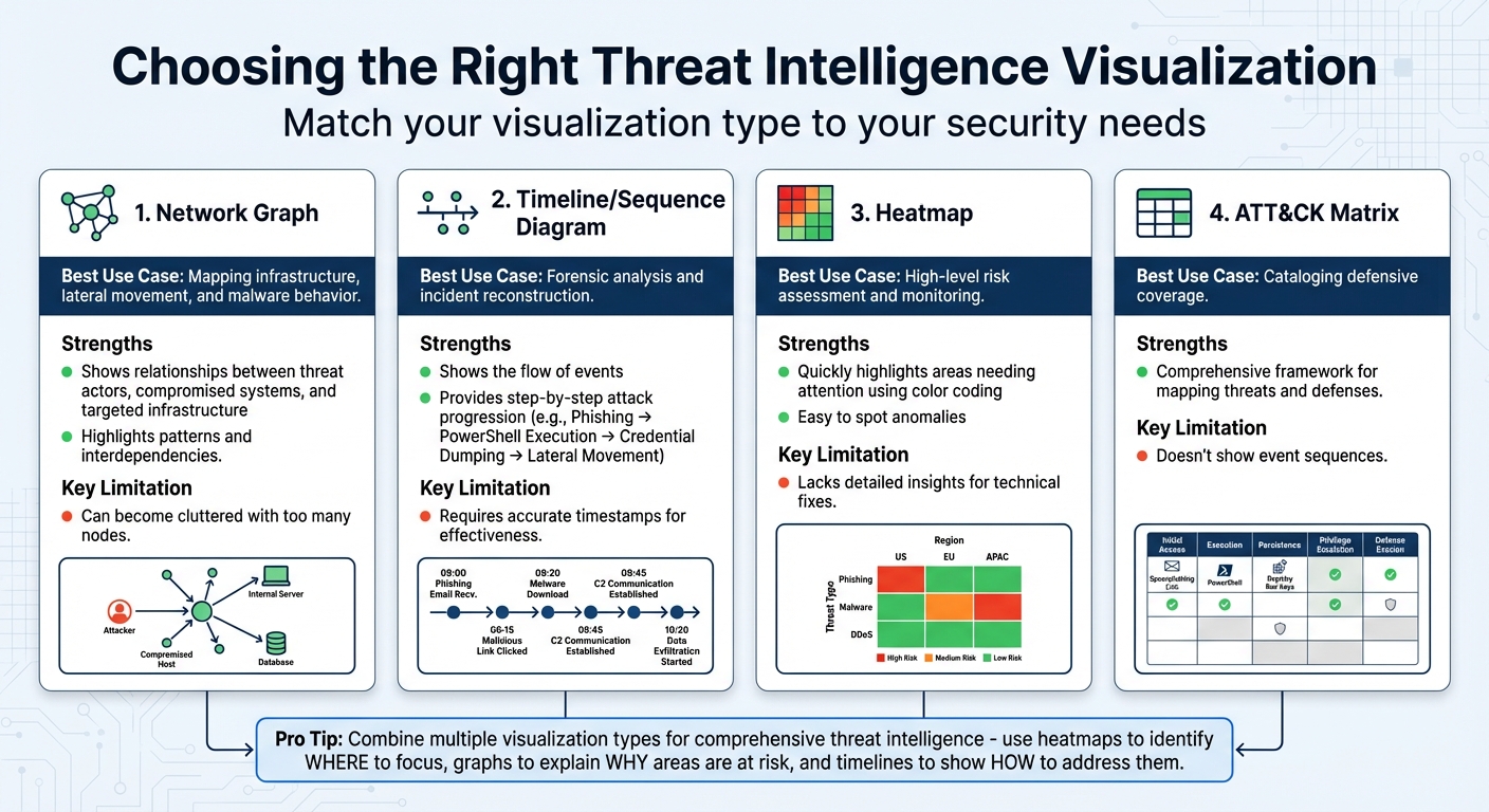
Threat Intelligence Visualization Types: Use Cases and Limitations Comparison
Picking the right visual format can make all the difference when it comes to spotting threats quickly. Security teams often turn to three main types of visualizations to transform raw threat data into actionable insights: graphs and network diagrams for mapping out connections, timelines and sequence diagrams to track the progression of attacks, and heatmaps and risk matrices for prioritizing threats. Each one has its strengths, and knowing when to use which format helps ensure clear and effective threat communication. Mastering these visualization types is key to creating visuals that suit both technical teams and executives.
Graphs and Network Diagrams
Network graphs are fantastic for showing how threats are interconnected. They map relationships between key entities like threat actors, compromised systems, and targeted infrastructure. Unlike rows of data in a spreadsheet, these diagrams highlight patterns, such as lateral movement across systems. For example, a graph might illustrate how one stolen credential is linked to several compromised assets. This makes it easier to spot interdependencies and focus on critical choke points.
These diagrams are especially useful for visualizing malware behavior and attack paths. For instance, a graph could trace how a phishing email triggered a cascade of system breaches, exposing the dependencies that allowed lateral movement. The downside? If the graph becomes too detailed, it can overwhelm viewers. To keep it effective, focus on the most important connections and choke points.
Timelines and Sequence Diagrams
If network graphs answer the question of what is connected, timelines and sequence diagrams tackle when and how events occur. These tools are crucial for forensic investigations and piecing together the sequence of an attack. While traditional matrices might list capabilities or techniques, they often fail to show the flow of events. Timelines fill this gap by presenting a clear narrative.
For example, Attack Flows provide a step-by-step breakdown: Phishing → PowerShell Execution → Credential Dumping → Lateral Movement. This approach doesn’t just show what tools attackers used – it explains the campaign’s progression. Some advanced tools even include features like "Story Mode", which animate these sequences, making it easier for executives to grasp the technical chain of events.
Heatmaps and Risk Matrices
Heatmaps are all about simplicity. Using color-coded visuals – red for high risk, green for low – they quickly highlight areas that need attention, like vulnerable assets or regions with outdated defenses. For example, a heatmap might reveal a spike in failed login attempts within a specific network segment, making it easy to spot anomalies or suspicious activity.
Risk matrices take this a step further by plotting threats based on likelihood and potential impact. This makes them a go-to tool for prioritizing resources, especially for executives and risk managers. However, heatmaps and matrices have their limits. While they provide a great high-level overview, they don’t dive into the technical details required for resolving issues. That’s why they work best in combination with other tools – heatmaps show where to focus, while graphs and timelines explain why those areas are at risk and how to address them.
| Visualization Type | Best Use Case | Key Limitation |
|---|---|---|
| Network Graph | Mapping infrastructure, lateral movement, and malware behavior | Can become cluttered with too many nodes |
| Timeline | Forensic analysis and incident reconstruction | Requires accurate timestamps for effectiveness |
| Heatmap | High-level risk assessment and monitoring | Lacks detailed insights for technical fixes |
| ATT&CK Matrix | Cataloging defensive coverage | Doesn’t show event sequences |
Next, we’ll dive into how to adapt these visualizations for different audiences.
Designing Visuals for Different Audiences
Threat intelligence isn’t a one-size-fits-all scenario – different audiences interpret and act on it in unique ways. A security analyst needs granular, interactive tools to dig into the details, while an executive wants a quick overview of the business risks. Cross-functional teams, like legal or HR, fall somewhere in between, seeking clarity without unnecessary technical jargon. The trick lies in tailoring visuals to meet the priorities of each group. By designing with the audience in mind, you can turn complex threat data into actionable insights for everyone. Here’s how to approach visuals for security analysts, executives, and cross-functional teams.
Visuals for Security Analysts and SOC Teams
Security analysts thrive on detail, not decoration. They need interactive dashboards that let them explore data deeply – filtering, sorting, zooming, and using tooltips to uncover root causes. For instance, if a heatmap flags an anomaly, analysts should be able to pivot to a network diagram to trace the attack’s origin. These tools aren’t about looking pretty; they’re about cutting through the noise to find actionable insights.
Details matter here. Analysts rely on visuals that highlight specific information, like compromised IPs, affected accounts, or attack vectors tied to MITRE ATT&CK tactics. Considering that over 70% of SOC analysts report burnout – often leading to high turnover in just three years – effective visualizations can help reduce alert fatigue and improve retention rates.
"Static dashboards enable you to spot problems, but interactive dashboards give you the information you need to resolve them." – Twain Taylor, Guest Blogger, Recorded Future
To keep dashboards functional, stick to Edward Tufte’s principle of maximizing "data ink" by eliminating unnecessary elements like 3D effects or over-the-top fonts. Use sparklines – tiny, minimalist charts – to display trends for multiple metrics without cluttering the screen. Add urgency with color-coded gauges (red, yellow, green) to highlight outliers. For example, filter metrics like "failed logins" to only show external attempts or those exceeding a threshold, such as 10+ tries, to reduce distractions.
Visuals for Executives and Decision-Makers
Executives don’t have time to sift through technical logs. They need visuals that cut straight to the point: What’s the impact on the business? That means translating technical risks into financial terms, such as potential losses exceeding $1 million or regulatory fines tied to specific vulnerabilities. Risk heat maps are particularly effective here, using a 5×5 matrix to show risks based on likelihood and impact, with concrete metrics like dollar amounts and probability percentages instead of vague labels like "High" or "Low".
Compact tools like bullet graphs and sparklines work well for summarizing key metrics. Gauges can highlight "vital health statistics" or single-number metrics, making it clear whether a value is within normal limits or needs immediate attention. These visuals support quick decision-making.
For example, in March 2024, Dragonfly introduced a Visual Analysis section in its SIAS platform, featuring an interactive crisis map for the Israel/Hamas conflict. The map tracked real-time data on rocket attacks and border crossings across multiple countries, helping organizations make strategic decisions during a volatile situation. Later that year, Dragonfly expanded with an interactive election risk map covering 50 nations, enabling users to view election details and risk ratings with direct links to intelligence dossiers.
Dashboards for executives should start with a one-paragraph summary that sets the scene, focusing on metrics that matter most to the business. Highlight critical assets – like the organization’s "crown jewels" – and design visuals that flag when these are at risk. Differentiate between operational metrics (e.g., log volumes) and executive metrics (e.g., mean time to detect or risk registry summaries) to keep the focus sharp.
Visuals for Cross-Functional Teams
Cross-functional teams, like legal, compliance, and HR, require a middle ground: visuals that are clear but still provide essential context. Avoid technical jargon and stick to standardized color codes (red for critical, yellow for warning, green for safe) with brief captions to ensure clarity.
Accessibility is crucial – follow WCAG guidelines by pairing colors with icons, labels, or patterns so that even color-blind users can interpret severity levels. Use progressive disclosure, starting with a summary (like a risk score) and allowing users to drill down into details if needed. Keep designs clean by removing unnecessary elements like 3D effects or heavy gridlines, ensuring the focus stays on the data.
"It can be difficult to get – and maintain – the attention of the board when it comes to risk. Sending them multiple pages full of text is unlikely to engage them in a meaningful way when they’re already juggling other priorities." – Risk Leadership Network
Infographics are a great tool for explaining complex schemes like phishing to general staff, breaking down technical issues into relatable, digestible visuals. Incident timelines are another effective option, showing the chronological progression of a cyber event to help non-technical stakeholders understand its impact. Combining timelines with mitigation details can also help teams learn from past incidents.
| Visual Tool | Best Use for Cross-Functional Teams | Key Benefit |
|---|---|---|
| Heat Maps | Visualizing risk levels across units or geographies | Quickly identifies high-risk zones with color-coding |
| Infographics | Explaining schemes like phishing | Simplifies complex problems into engaging visuals |
| Impact Analysis | Modeling breach scenarios (e.g., financial fallout) | Helps prioritize budgets based on potential loss |
| Incident Timelines | Showing the chronological order of a cyber event | Explains assault impacts to non-technical stakeholders |
Tools for Visual Threat Intelligence
The right tools can transform how threat intelligence is visualized, making data more accessible, actionable, and seamlessly integrated into your security workflows. Some tools focus on detailed log analysis and SIEM integration, while others consolidate data from multiple sources into a single, cohesive view. Whether your team prioritizes in-depth threat hunting, executive-level reporting, or multi-platform monitoring, choosing the right tool ensures your visuals serve their purpose effectively.
Threat Intelligence Platforms
Take The Security Bulldog for example. This platform is tailored for cybersecurity teams, offering AI-driven visualization features. Its natural language processing (NLP) engine simplifies open-source intelligence from resources like MITRE ATT&CK and CVE databases, helping users map out threat actor relationships and customize dashboards. It also integrates with SOAR systems, enabling automated workflows and actions triggered directly from its visual tools. Pricing starts at $850 per month for up to 10 users, which includes features like semantic analysis, custom feeds, and 24/7 support.
Integration with Cybersecurity Workflows
Creating impactful visuals is only part of the equation – integrating these tools into your existing workflows is where they truly shine. When tools like The Security Bulldog connect with enterprise systems, they streamline operations and enhance collaboration. For instance, the platform centralizes investigation workflows by linking alert details with external ticketing systems, reducing friction between analysts and other teams. It also supports interactive dashboards, allowing users to navigate seamlessly between high-level summaries and detailed technical investigations. These dashboards are updated dynamically based on global filters, ensuring the latest data is always at your fingertips.
Additionally, the platform bridges SIEM, EDR, and cloud security tools by offering prebuilt detection rules and machine learning capabilities. These features automatically flag unusual activity and present the findings in customizable dashboards. For stakeholder communication, automated reports in PDF or PNG formats can be generated, or live visualizations can be embedded directly into internal web pages.
With tools like these powering your threat intelligence visuals, the foundation is set for refining your creation process and adopting best practices for even greater impact.
Best Practices for Creating Threat Intelligence Visuals
Creating effective threat intelligence visuals involves careful data preparation, consistent design, and evaluating their impact to ensure they lead to actionable insights.
Data Preparation and Modeling
Start by cleaning and standardizing your raw threat data. This includes removing duplicates using fingerprinting methods during data ingestion and normalizing timestamps to formats like STIX 2.1 or Elastic Common Schema (ECS). To comply with data protection laws, make sure to obfuscate any personally identifiable information (PII) before creating visualizations.
Incorporate indicator expiration modeling to ensure your visuals only display active and relevant threats. Use fields like valid_until or revoked to manage this, and apply a default expiration period of 90 days from the source timestamp.
"A great data visualization is one that conveys the ‘most ideas, with least ink, in least space, least time’".
Once your data is cleaned and standardized, you can focus on presenting it in a way that promotes clarity and ease of understanding.
Maintaining Visual Consistency
Consistency in your visuals helps teams interpret data more efficiently. Organize your dashboards into three categories: Static (for historical data and scheduled reports), Interactive (for live investigations), and Executive (for high-level summaries). This structure reduces cognitive load by creating predictable patterns.
Stick to basic chart types like bar and line charts for static reports, and only use pie charts when there are three or fewer slices. Consistent color schemes across all visuals can improve information retention by up to 80%. Additionally, using a standardized icon library for threat types, severity levels, and actions can speed up interpretation since visual symbols are processed faster than text.
Ensure uniformity in dashboard timeframes with a synced time picker and normalize metrics to a 0–100 scale to avoid mismatched axes. Place the 2–3 most critical indicators, such as current error rates or active incidents, at the top of the dashboard to provide quick situational awareness.
Measuring Visual Effectiveness
After creating your visuals, it’s essential to measure their impact on operational performance. Monitor metrics like Mean Time to Detect (MTTD) and Mean Time to Respond (MTTR) before and after implementing the visuals. For example, a UC San Diego research project led by Timothy D. Harmon (CISSP) in August 2025 analyzed 40,000 security events using Tableau. By transforming raw Kaggle dataset events into interactive heatmaps and geospatial maps, the study reduced threat analysis time by 45% and identified 15% more potential threats.
Track user interactions, such as click-through rates, hover engagement, and scroll depth, while ensuring dashboards load within 2 seconds to maintain user engagement. Measure your "Actionable Intelligence Rate", which reflects the percentage of visuals that directly lead to defensive actions like blocking an IP or patching vulnerabilities. Research shows users are 80% more likely to engage with interfaces that include dynamic charts and graphs compared to static formats.
Use heatmaps to identify which 20% of visual elements attract 75% of user attention, then focus your design efforts on those high-impact areas. Finally, integrate simple feedback options like ratings or comment sections into dashboards – 60% of users are more likely to value applications that offer these features.
Conclusion
Key Takeaways
Visuals play a crucial role in improving threat detection and response. Since the brain processes visuals much faster than text, well-designed graphics can help teams identify threats more quickly. Tools like interactive dashboards and heat maps not only save time but also reveal threats that might otherwise go unnoticed.
The effectiveness of these visuals depends on how well they are tailored to the audience. For example, analysts benefit from detailed network diagrams and interactive dashboards, while executives need clear, high-level visuals like infographics and risk matrices. Simplified timelines and incident response maps are especially helpful for cross-functional teams, bridging the gap between technical and non-technical stakeholders.
Whether you’re using platforms like Kibana or creating custom dashboards in Tableau, the goal remains the same: turning raw data into insights that drive action. As Gifty Boakye, Systems & Security Analyst, puts it:
"Dashboards don’t replace investigation, they guide where investigation should start."
By applying these strategies, you can transform complex threat data into tools that help your team act faster and smarter.
Next Steps for Implementation
To bring these ideas to life, start small. Create a single, high-priority dashboard that addresses a specific problem your team faces. This focused approach delivers quick results and helps demonstrate value to leadership, paving the way for broader adoption down the line. When designing visuals, avoid clutter like 3D effects, unnecessary gridlines, and decorative elements.
Establish a feedback loop by tracking metrics like Mean Time to Detect (MTTD), user engagement, and data retrieval speed. Aim for dashboards that load in under 2 seconds and allow analysts to find critical information within 5 seconds. Additionally, ensure your visuals support real-time monitoring and integrate with automated alerting systems, so your team can respond faster as new threats emerge.
FAQs
Which threat intel visuals should I use first?
When dealing with complex data, visuals make all the difference. Tools like dashboards featuring threat maps or trend charts can give a quick, clear snapshot of attack trends and vulnerabilities. Want to identify patterns over time or spot anomalies? Heatmaps and line charts work wonders. These formats don’t just look good – they help both technical teams and decision-makers grasp the threat landscape quickly. And when understanding happens faster, so do the responses.
How do I tailor dashboards for executives vs. analysts?
To design dashboards that truly serve their purpose, it’s essential to align them with the specific needs of their audience.
Executive dashboards should prioritize clarity and simplicity. These are meant to showcase strategic insights and high-level trends, helping leaders make swift, informed decisions. Keep the focus on business outcomes and avoid overwhelming the view with unnecessary details.
On the other hand, analyst dashboards require a different approach. These should provide access to detailed, real-time data, logs, and technical metrics. Granular visualizations and advanced filtering options are key here, enabling analysts to effectively detect threats and respond to incidents with precision.
How can I prove visuals improved MTTD/MTTR?
To show how visuals can enhance Mean Time to Detect (MTTD) or Mean Time to Respond (MTTR), it’s essential to compare key metrics from before and after introducing tools like dashboards. By using trend lines or heatmaps, you can clearly illustrate how these times decrease over a specific period.
Highlighting average detection and response times alongside real-time improvements is crucial. Dashboards, for instance, offer immediate insights while historical data provides the necessary context to track progress. This combination of real-time and historical data not only demonstrates improvements but also makes it easier for stakeholders to see and act on these changes. Visual reports turn raw data into actionable insights, ensuring that the impact of these tools is both clear and measurable.